Global Citizen 2.0
REDESIGNING A SOCIAL ACTIVISM PLATFORM
An expansive redesign of Global Citizen’s platform that rethought the way users take action on pressing issues, solidified a gamified approach, and unified the architecture and design across all entrypoints.
MY ROLES
Strategy, Design, App Consulting
Why was there an issue?
~90% of our active users dropped off after key events
Consistent feedback from users and staff on pain points
COVID created an issue with our format
Product backlog and slow deliverability
Discovery
In order to better pinpoint the specific issues and gather together an intuitive and resourceful plan we explored through three methods:
Audit
We looked over 30 page templates and 250 pages across the site & app judging on a set of heuristics and cataloging visual styles
What we looked for: Context, brand consistency, accessibility, interactivity
What we found: Mass style inconsistencies (including 25 shades of gray), unclear navigation and context, and rigid structure
External Interviews
A combination of interviews and usability tests with both mega-users and completely new users
What we looked for: Pain points, features that work and ones that didn’t, and understanding how and why they use Global Citizen
What we found: Our users are disparate in why they come to us. Struggles with navigation, context, and info overload
Internal Interviews
Through brainstorming and interviews met with exec, team leaders, and members from all 15+ teams
What we looked at: Resources that would help them, where they saw the product evolving, what they have heard from partners and the people they work with
What we found: Needs to evolve existing structures, lack of flexibility with the product, maintaining a consistent audience
The 5 distinct areas that we needed to address moving forward:
Structural: Establish a cohesive structure that was easy to navigate and adapt
Contextual: Create a catered and understandable experience
Actions: Make our core product work better
Visual: Unify the brand and create a visual architecture
Fun: Incentivize return by making the experience more enjoyable
Identifying
the issues
Structural
Modular Design: We moved from a slurry of rigid templates with varying styles and not a lot of room for customization to more modular plugins that we would be able to create new pages faster and with more flexibility to adapt to ever-changing needs.
Navigation: Overall, we moved from 18 nav points to 6 all focused on the core 6 reasons users were coming. We shrank the categorization from 8 issue areas to 3 in order to simplify for the top of the funnel new users.
Template Updates: We altered the templates to be more flexible and created new templates to integrate more movability deeper into the GC experience.
Contextual
We altered the thinking of how we treat our users as a monolith to a funnel approach – tailoring experiences based on why they came to us and then training them to explore more and become more involved
Campaigns: One of the biggest ways we did this was with campaigns. We moved from one-off actions to a grouping where users ended up taking 3x more actions each time. On app we expanded the experience more, including videos and content and created storied experience that ran them through. This let them learn in a more linear way and break from the repetition.
Recommendation engine: We doubled the click through rate on related content by developing a recommendation engine that pulled relative content, actions, and rewards based on users’ previous activity.
Content: We changed the structure of our articles to include a “Why this matters” and an action that scrolls with the users as they read to provide context and push them to go deeper into action taking.
Actions
Our main goal for actions was to move from passive to engaged interaction. Users struggled to grasp what they were taking action on. Also, with COVID our rewards program faltered a bit so we had to adapt our thinking that actions weren’t as much a tool for rewards but more a tool for their activism.
Education: We moved from easy one-click actions whose context was paragraphs of explainer text to a simple 3 bullet points alongside the action (why, who, what).
Adaptable: This simplification of the action allowed us to retool the actons from one-off pages to adaptable plugins that we could fit more seamlessly within our platform and across other platforms including a bot on facebook, allowing us to grow our audience even further.
Flow for new users: For new users we created a more seamless flow of sign up to action to rewards.
Visual
We were looking at 3 generations of disparate designs across all of our pages (like a total of 25 shades of gray). We took a new approach focusing on conciseness, interactivity and adaptability. While we redesigned the visual architecture to be more flexible, we also brought our experience into following ADA guidelines.
Pattern Library: Created GC’s first pattern library for consistent use across the platform
Color & font: Consolidated colors into specific uses and shrunk our font styles from 64 to standard.
Image: Eliminated excess image sizes and used a standard for cards, content, and rewards to help alleviate asks and add consistency
Fun
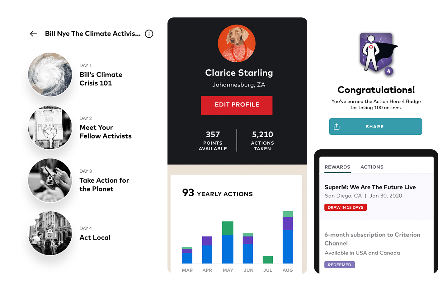
Rethinking the way to create sustained engagement after our festivals we looked to game app dynamics to better create a sense of community and fun.
Challenges: We created daily and sustained challenges that users can take. This helped create a larger portion of daily action-takers.
Loyalty Program: We altered up our rewards program with tiered entries and based it on monthly action-taking. This allowed us to re-engage older users and brought in new partnerships.
Profiles & Badging: We created user profiles that allowed users to see the progress they’ve made and have access to all their info in one place. Alongside the profiles, we set up a new system where users gained badges for their engagement. These lead to a spike in social engagement from our users.


